

To design your Angular application, it is possible to use multiple CSS libraries, but Angular Material is specially designed for Angular projects and easy to implement. With mat elements, you can make a nice interface in a very short amount of time. Flex-layout is a package made for Angular to use CSS flex-box features, you just add directives in html tags to render it flexible and responsive. Let’s see how beginning with all this!
Create a new Angular project, install Material and flex-layout First, let’s create a new Angular project with @angular/cli in your code repository:
ng new material-project
cd material-project
ng serve
Then, let’s install the 3 main packages of Angular Material, run in a terminal:
npm install --save @angular/material @angular/cdk @angular/animations
In app.module.ts, you have to import ‘BrowserAnimationsModule’ and the Material modules you need for your project:
import { BrowserModule } from '@angular/platform-browser';
import { NgModule } from '@angular/core';
import { BrowserAnimationsModule } from '@angular/platform-browser/animations';
import { MatCardModule, MatIconModule, MatToolbarModule, MatButtonModule, MatFormFieldModule, MatInputModule } from '@angular/material';

import { AppComponent } from './app.component';

@NgModule({
  declarations: [
    AppComponent
  ],
  imports: [
    BrowserModule,
    BrowserAnimationsModule,
    MatCardModule,
    MatIconModule,
    MatToolbarModule,
    MatButtonModule,
    MatFormFieldModule,
    MatInputModule
  ],
  providers: [],
  bootstrap: [AppComponent]
})
export class AppModule { }
To be able to use the icons, you have to add a link tag in src/index.html:
<link href="https://fonts.googleapis.com/icon?family=Material+Icons" rel="stylesheet">
If you want to use a theme, you can add the following import in src/styles.css:
@import “~@angular/material/prebuilt-themes/indigo-pink.css”;
If you want gesture support, you have to install the package hammerjs
npm install --save hammerjs
And import it in your app’s entry point (usually it is the file src/main.ts):
import 'hammerjs';
Flex-Layout module
Install the flex-layout module with npm:
npm install @angular/flex-layout@latest --save
Then, import the module in your app.module.ts and add it to the NgModule’s imports:
import { FlexLayoutModule } from ‘@angular/flex-layout’;
@NgModule({
    declarations: [ ... ],
    imports: [ ..., FlexLayoutModule ],
})
export class AppModule { }
Create the main layout with a toolbar
To start fresh, remove all the html in app.component.html except the the title. Add a material toolbar after the title using the tags and if you want a vertical menu. Make sure you have imported the “MatToolbarModule” in app.module.ts.
<div style="text-align:center">
  <h1>
    Welcome to {{title}}!
  </h1>
</div>

<mat-toolbar>
  <mat-toolbar-row>
    <a target="_blank" href="https://material.angular.io/">Angular Material</a>
  </mat-toolbar-row>
  <mat-toolbar-row>
    <a target="_blank" href="https://www.npmjs.com/package/@angular/flex-layout">Flex-Layout</a>
  </mat-toolbar-row>
  <mat-toolbar-row>
    <a target="_blank" href="https://www.letsboot.com/">Letsboot.com</a>
  </mat-toolbar-row>
</mat-toolbar>
Create a simple photo gallery Example 1: A simple photo gallery Let’s display some photos with a flexible and responsive layout.
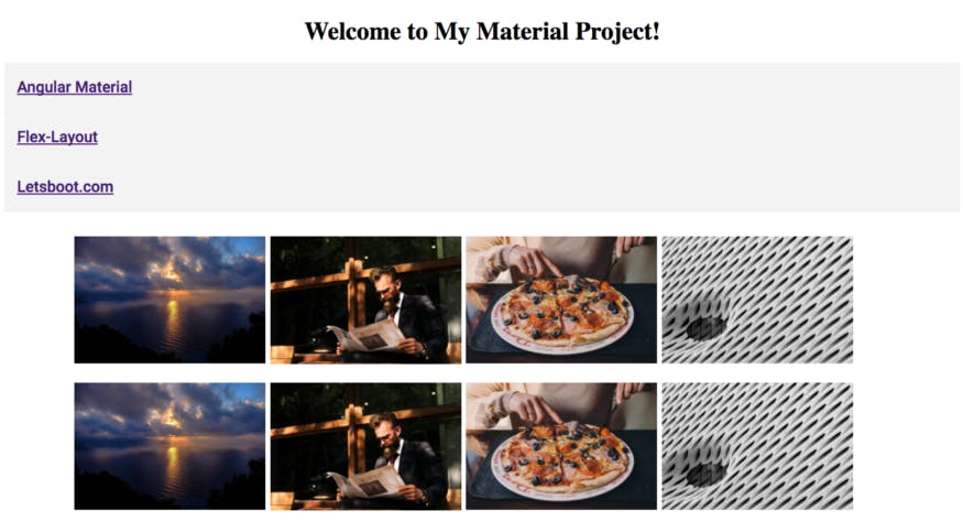 Screen shot of the example 1
To create the simple gallery, let’s use the fxLayout (container) and fxFlex (elements) directives and the mat-card-image element:
<div class="container" fxLayout="row" fxLayout.xs="column" fxLayoutWrap fxLayoutGap="0.5%" fxLayoutAlign="center">
  <div fxFlex="20%">
    <img mat-card-image class="img" src="https://d2lm6fxwu08ot6.cloudfront.net/img-thumbs/960w/8V46UZCS0V.jpg">
  </div>
  <div fxFlex="20%">
    <img mat-card-image class="img" src="https://d2lm6fxwu08ot6.cloudfront.net/img-thumbs/960w/LTLE4QGRVQ.jpg">
  </div>
  <div fxFlex="20%">
    <img mat-card-image class="img" src="https://d2lm6fxwu08ot6.cloudfront.net/img-thumbs/960w/R926LU1YEA.jpg">
  </div>
  <div fxFlex="20%">
    <img mat-card-image class="img" src="https://d2lm6fxwu08ot6.cloudfront.net/img-thumbs/960w/U9PP3KXXY2.jpg">
  </div>
</div>
Example 1: photo gallery with mat-card-image and flex-layout
Check the flex-layout official documentation to get all the directives and options. The CSS is at the end of the example 2 below.
Example 2: Create picture cards and a mini search form
In this case, let’s loop through an array and display the photos and its title with. I show you simply how to add icons and form field with Angular Material.
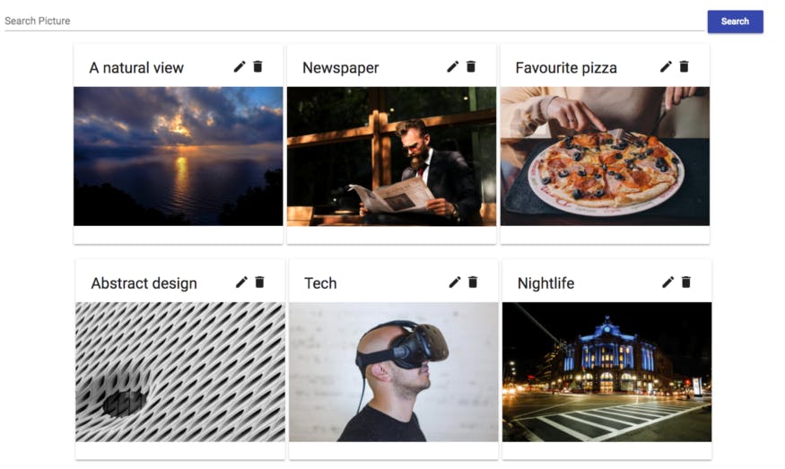 Screen shot of the example 2
Here you can find an example of a form. I use the elements and matInput. Do not forget to import MatFormFieldModule and MatInputModule in app.module.ts! You need both. For the photo gallery, wrap your all code with a
<mat-form-field class="search-form">
  <input matInput placeholder="Search Picture" type="text">
</mat-form-field>
<button button="submit" mat-raised-button color="primary">Search</button>
<br>

<div fxLayout="row" fxLayout.xs="column" fxLayoutWrap fxLayoutGap="0.5%" fxLayoutAlign="center">
  <mat-card class="card-picture" *ngFor="let picture of pictures">
    <mat-card-title fxLayout.gt-xs="row" fxLayout.xs="column">
      <span fxFlex="80%">{{picture.title}}</span>
      <mat-icon fxFlex="10%">mode_edit</mat-icon>
      <mat-icon fxFlex="10%">delete</mat-icon>
    </mat-card-title>
    <img mat-card-image [src]="picture.img">
  </mat-card>
</div>
Search bar and photo gallery with a “card layout” The search form is non-functional, it can be explained in an other article. Here is the related CSS of the example 1 and 2, add it to app.component.css:
.img {
  width: 100%;
  margin-bottom: 18%;
}
.card-picture {
  width: 23%;
  margin-bottom: 2%;
}
.container {
  min-height: 100%;
  width: 100%;
}
.search-form {
  width: 90%;
}
That’s it! You have now the basics to use Angular Material and flex-layout in your Angular project. Go to the official documentation to find and play with nice elements.
You can find the code on Github .